A news post has one job before anything else: stop the scroll. The headline, the story, the link, none of it matters if the design doesn't win that first half-second of attention. Below are 15 design ideas that do exactly that, some pulled straight from the Media Gridz template library, others patterns you'll recognize from major news brands. Each one is broken down by the specific design principle doing the work: contrast, scale, color, the curiosity gap, or repetition.
As a baseline, original A/B testing on Facebook found that image-based posts pull roughly four times more reach than plain link posts, a statistically confirmed difference. Design is a big part of why.
[Swap in your own screenshots for each brand example as you publish this, screenshots pulled directly from the live post work best.]
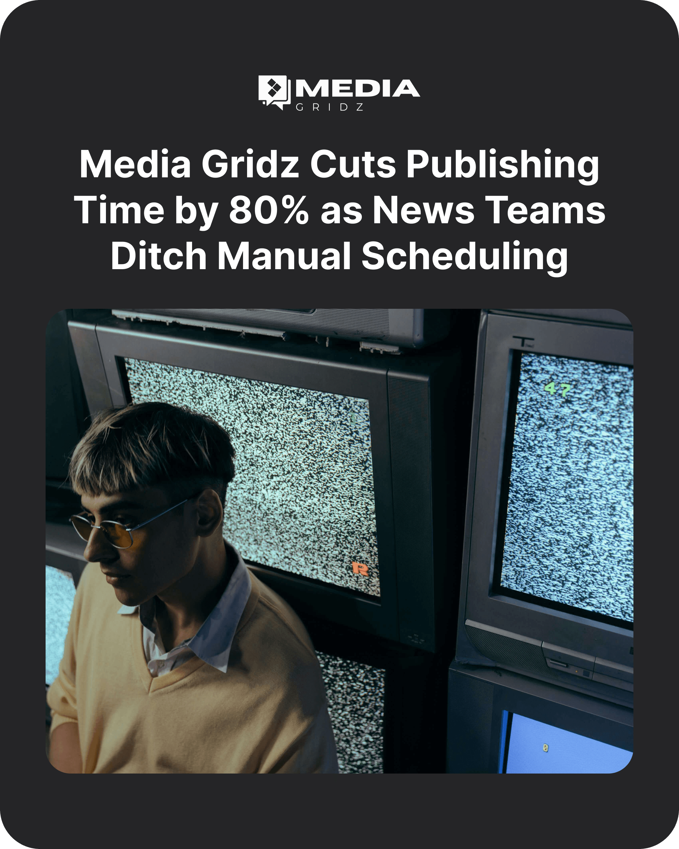
1. A Top-Anchored Headline
A full-frame photo with a bold white headline set across the top third, logo placed above, and an image below it
Why it grabs attention: Headlines placed at the top survive feed cropping and match how people scan top-down, so the message registers before anyone stops scrolling.
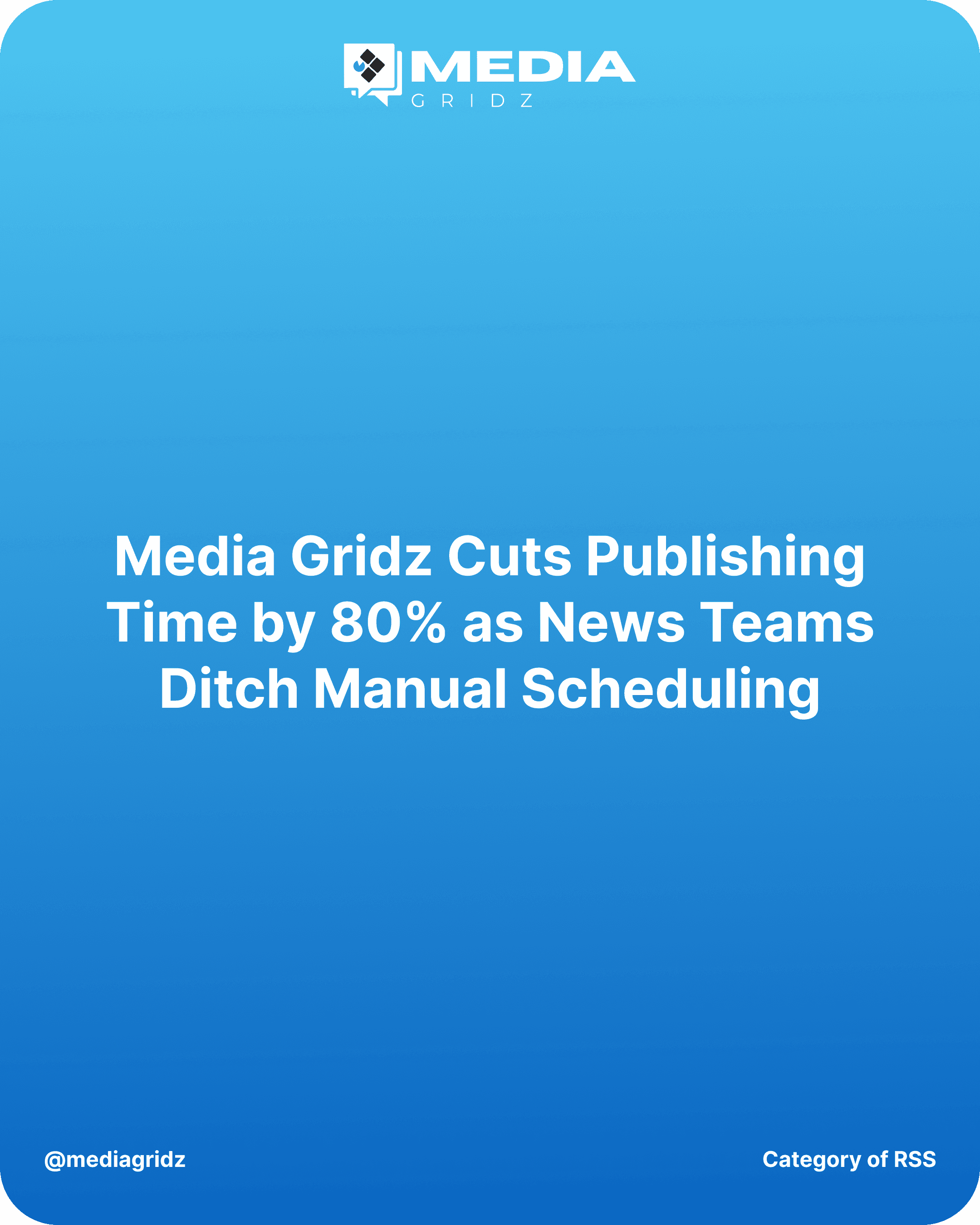
2. Color-Block Swap for Brand Recall
A centered headline layout with a bold gradient color (blue, in this case) instead of a photo.
Why it grabs attention: A sudden color shift in an otherwise photo-heavy feed creates contrast against everything around it. Reusing it consistently also trains the audience to recognize the brand at a glance, before they even read the logo.
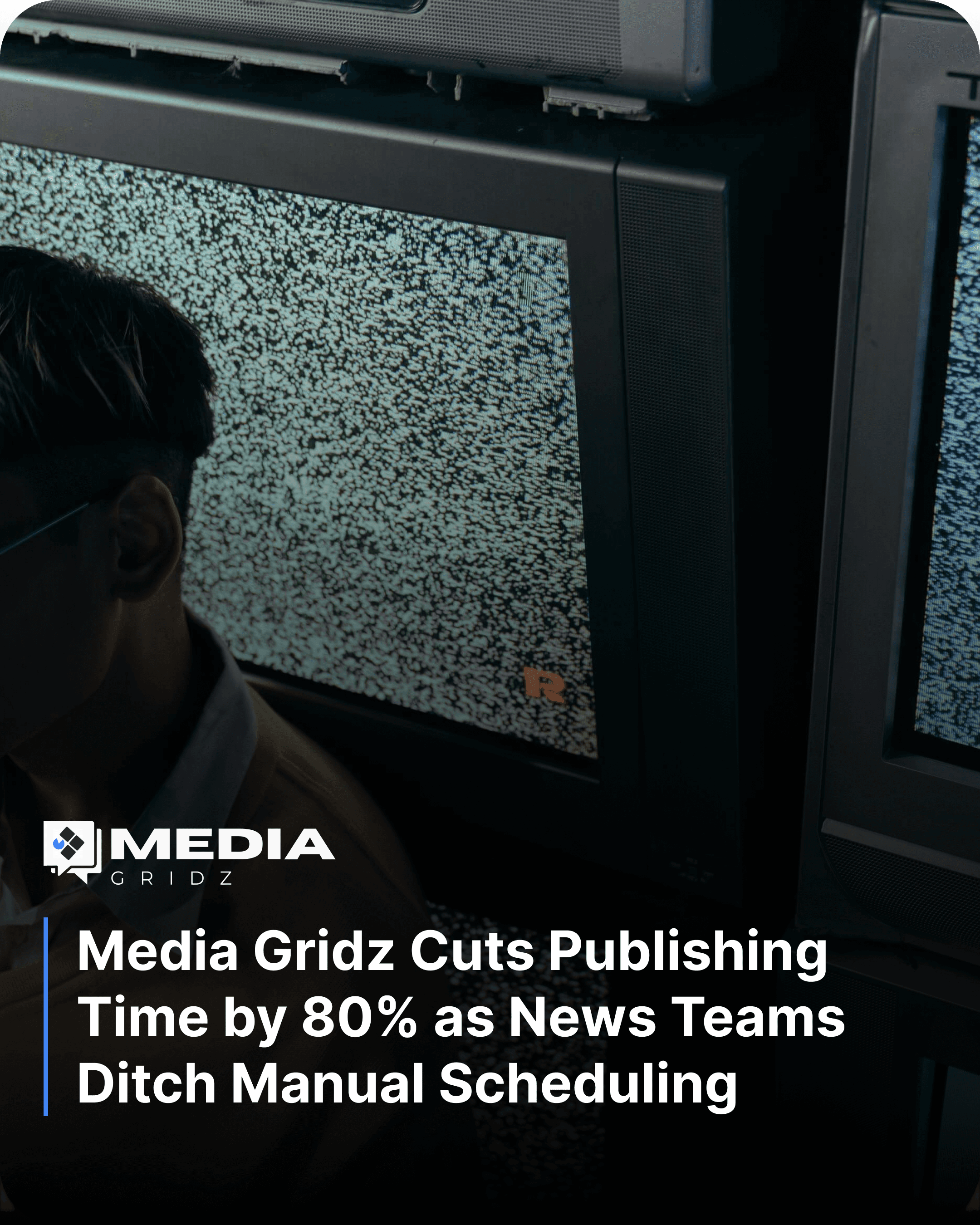
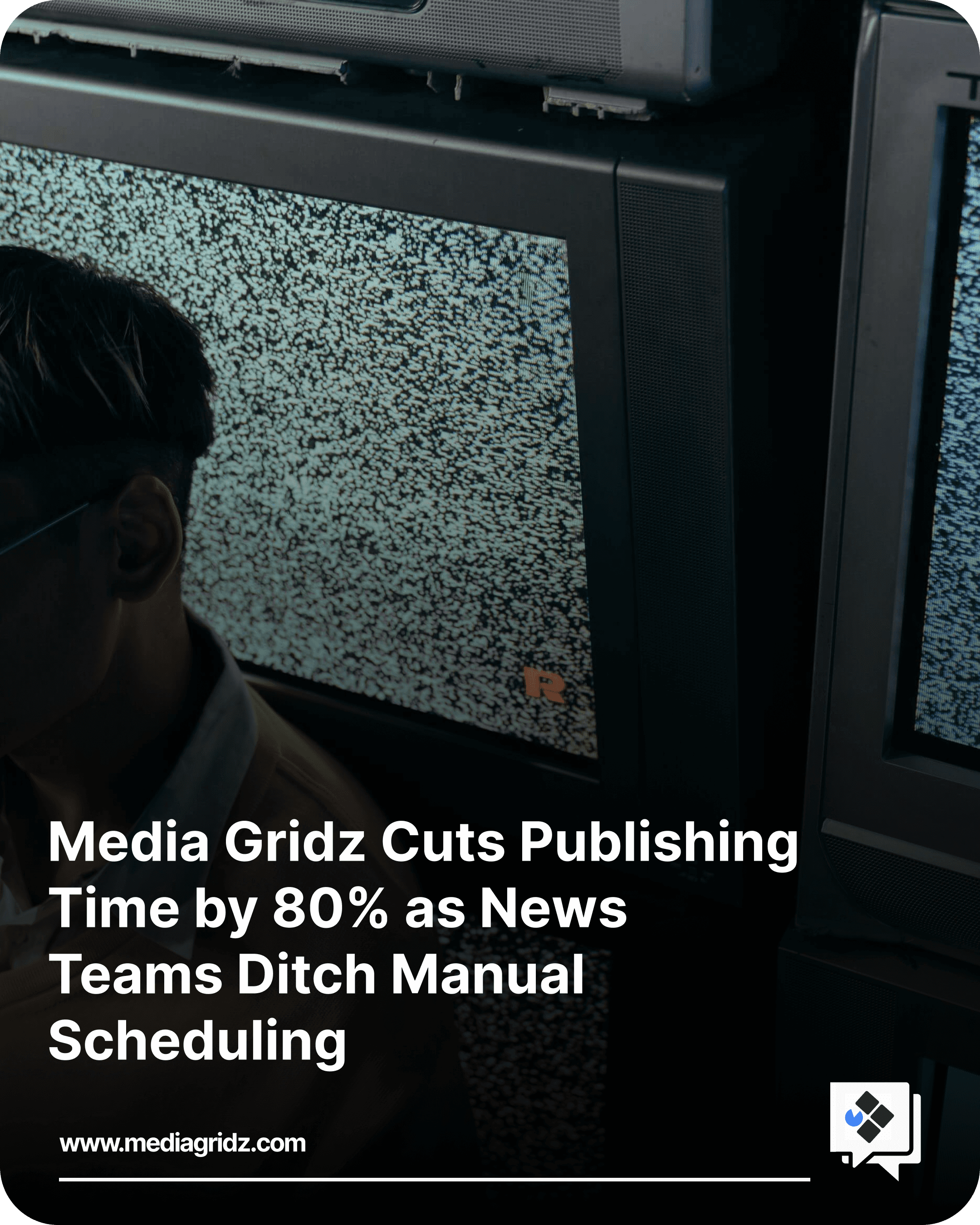
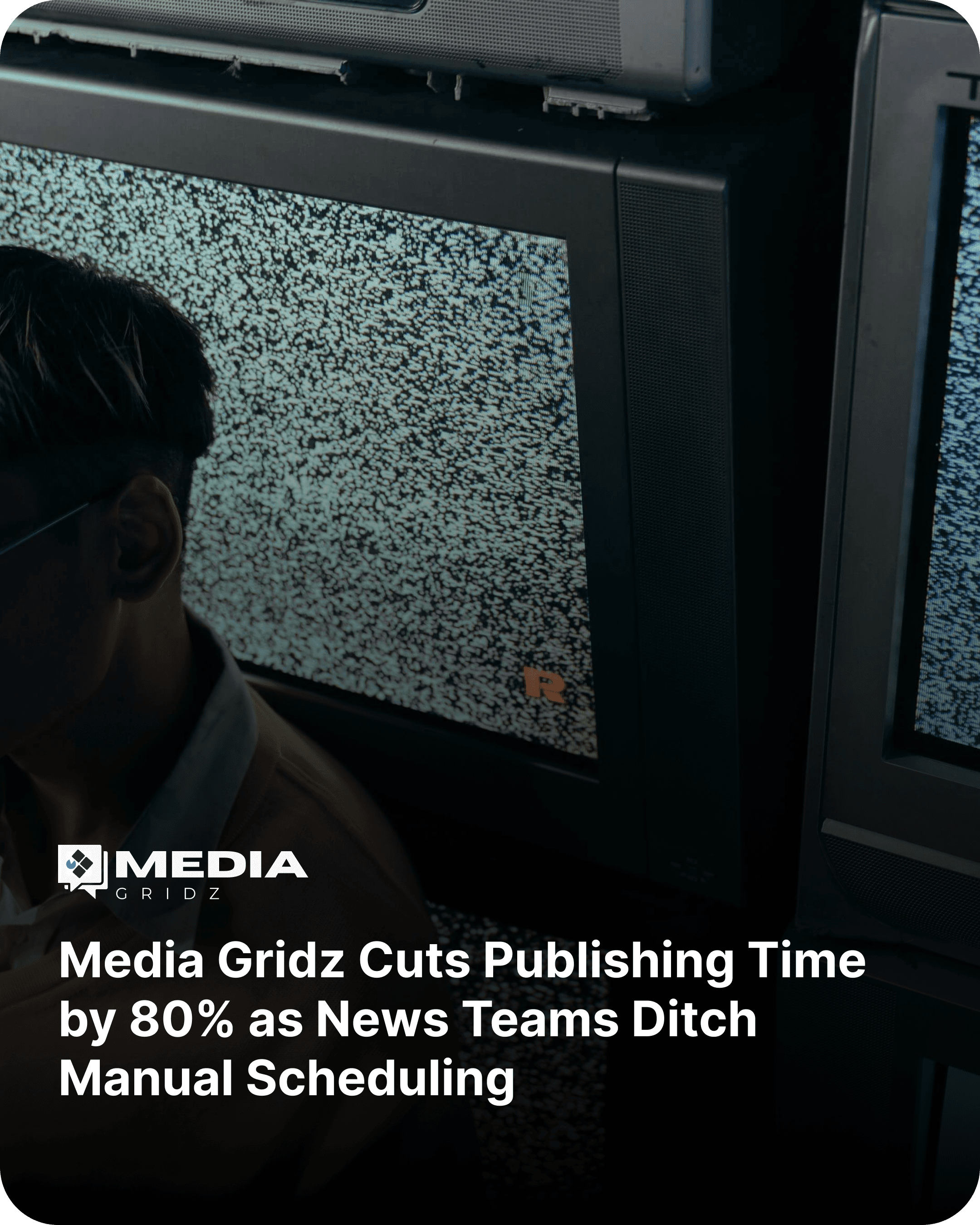
3. Full-Screen Image Overlay
Darker photo for background and headline aligned bottom-left with accent line for focus
Why it grabs attention: Full-bleed vertical images remove every visual distraction around the edges, so images where people or eyes are present, would trigger more attention capture.
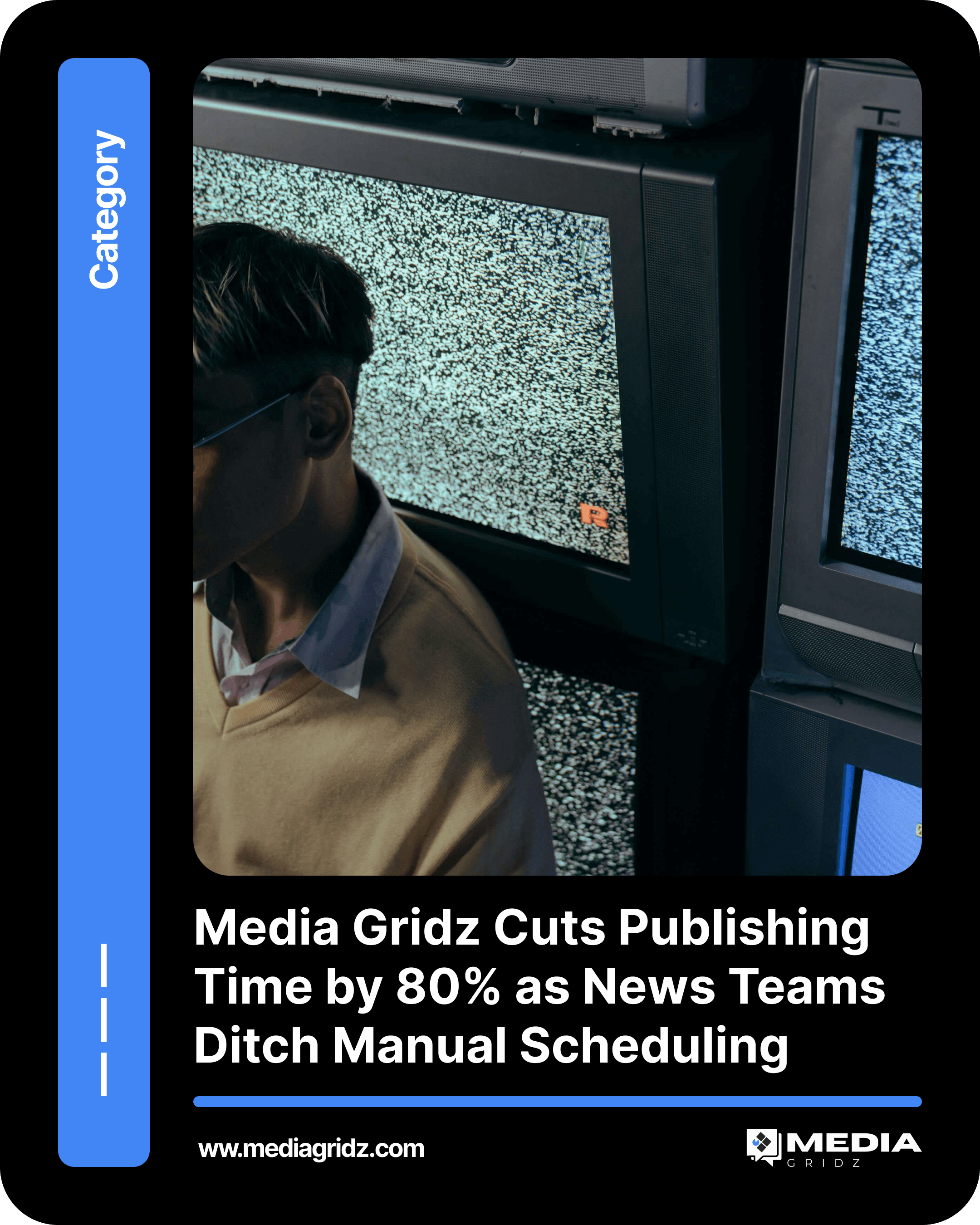
4. Category Tag Badge
A small labeled badge using your dynamic article category placed in a corner or side rail, tagging the story's section before the headline is even read.
Why it grabs attention: A category badge lets returning followers filter attention instantly. Someone who follows for tech news can spot and skip past unrelated categories in a glance, which sounds counterintuitive but actually builds trust in the feed long term.
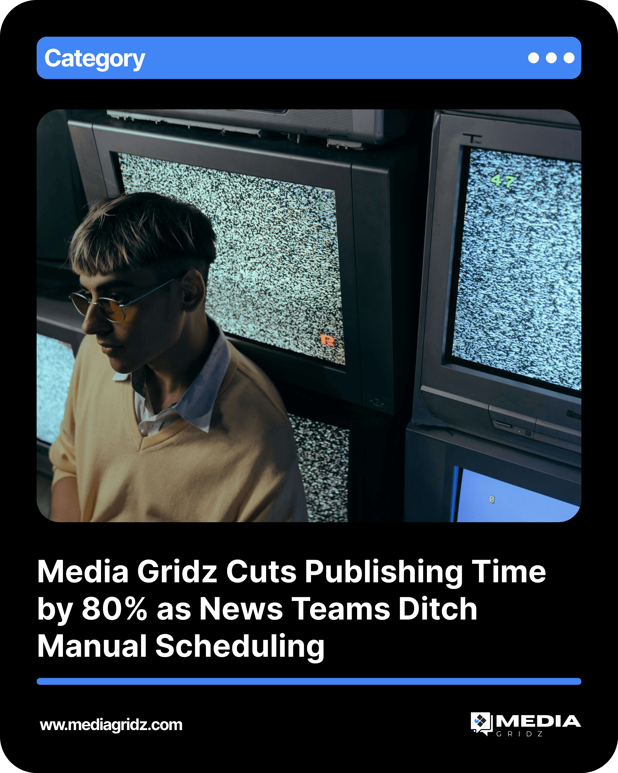
5. Link-in-Bio CTA Button
Media Gridz template. A bright, high-contrast button reading "link in bio" placed at the bottom of the post.
Why it grabs attention: Instagram doesn't allow clickable links in captions, so this button closes the gap between curiosity and action. Without it, exploratory behavior has nowhere to go.
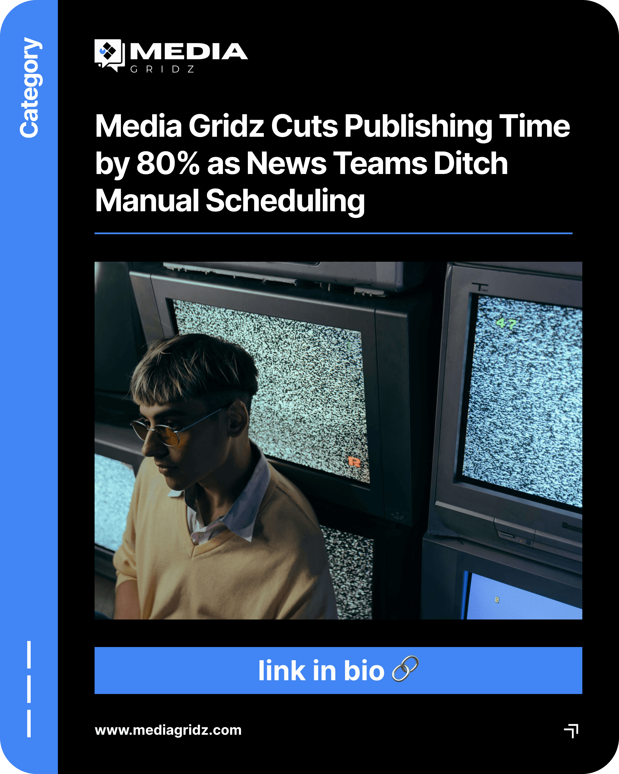
6. Persistent Footer Branding
Media Gridz template. A consistent website URL and logo mark placed in the same footer position across every post format. Why it grabs attention: This isn't designed to grab attention on a single post, it's designed to build recognition across dozens of them. Repetition in the same position, post after post, is what turns a design into a recognizable identity.
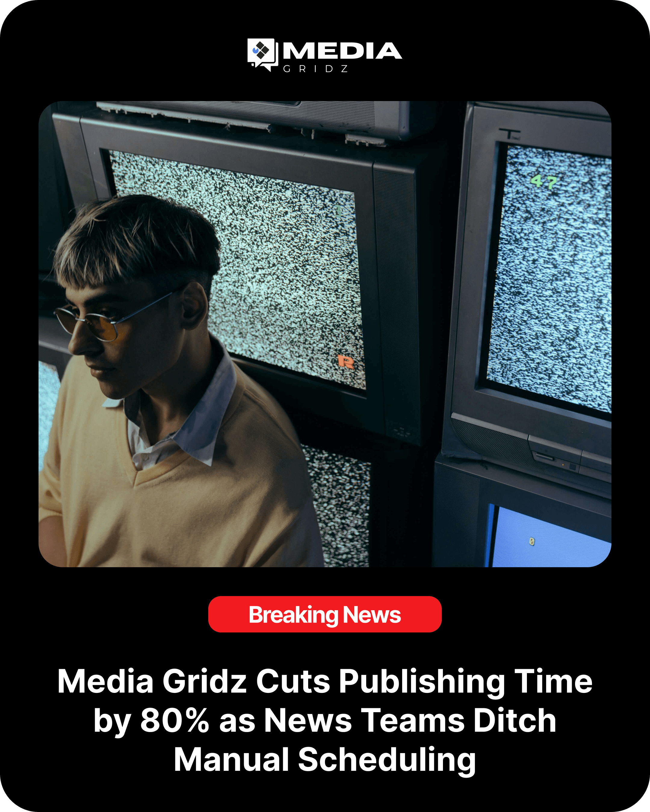
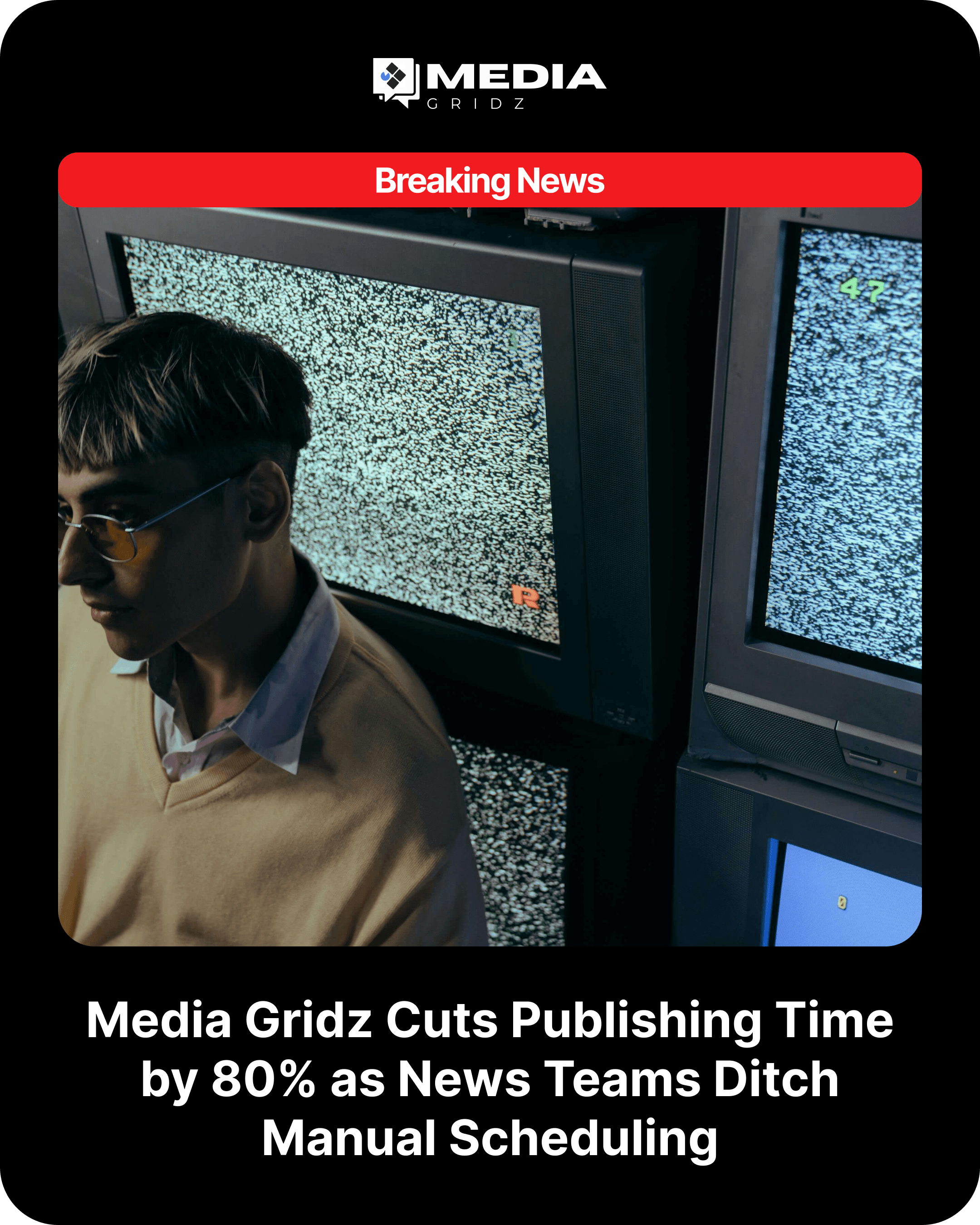
7. Breaking News Banner
Common industry pattern, used widely by broadcasters like BBC News and CNN. A high-contrast banner, usually red, layered across the image with a short urgent line.
Why it grabs attention: Contrast against the rest of the visual field is what triggers the "stop scrolling" reflex. This only works if it's reserved for stories that actually earn the urgency.
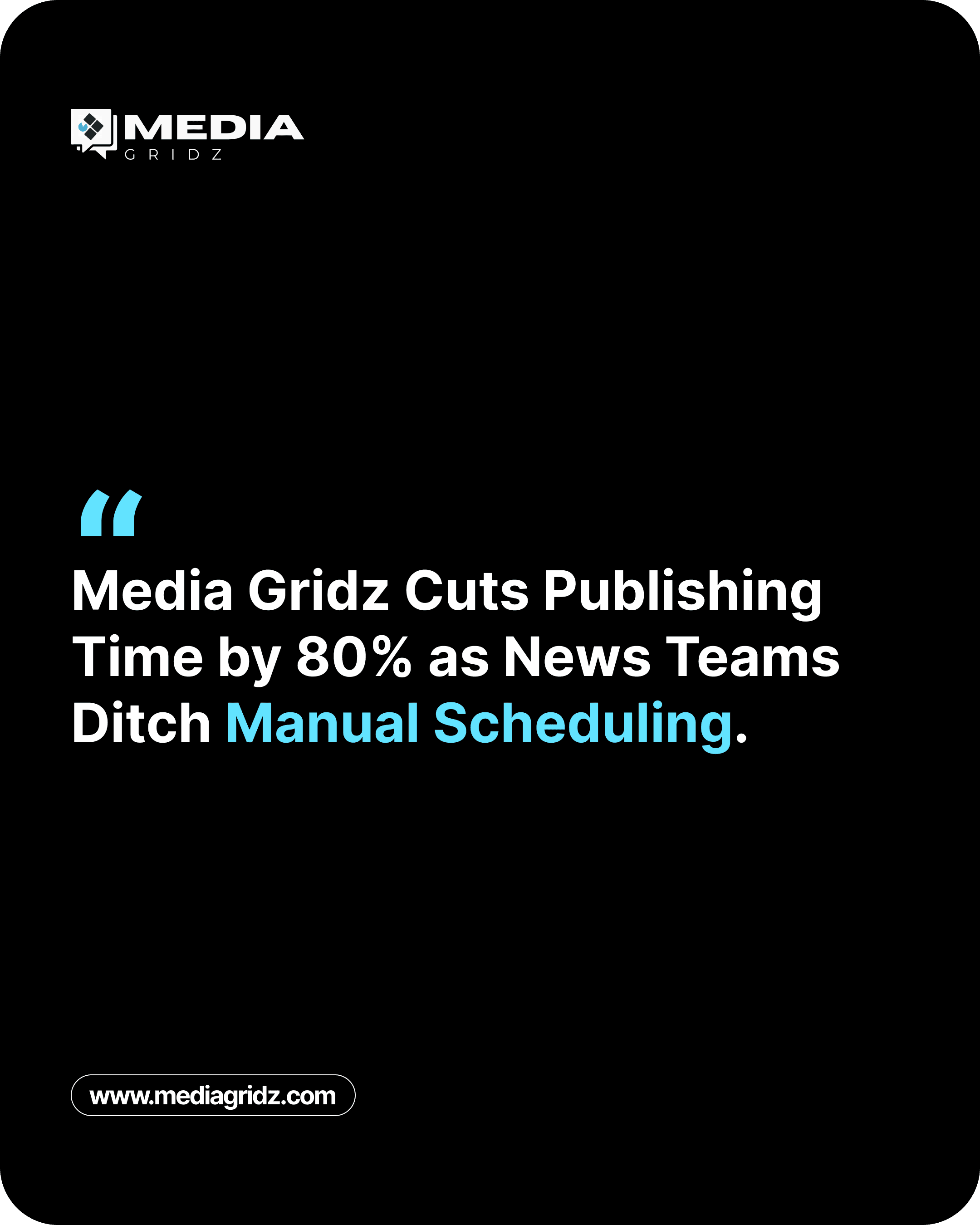
8. Isolated Quote Card
Common industry pattern, frequent on business and political accounts. A single attributed sentence set against a clean or dimmed background.
Why it grabs attention: Isolating one sentence creates a visible information gap. Readers sense there's more behind the line and want to close that gap by reading further.
9. Bold Stat or Data Card
Common industry pattern, popular with finance and business outlets. One large number set in oversized type, with a short line of context underneath.
Why it grabs attention: Concrete numbers are processed faster than abstract claims, and the scale of the type does the attention-holding work on its own.

10. Minimal Photo Caption Overlay
Common industry pattern, typical of photojournalism and sports accounts. A striking photo with only a short caption, no heavy graphic treatment. Why it grabs attention: When the photo is the story, restraint is the design choice. Extra graphic elements would compete with the image instead of supporting it.
Putting This Into Practice
The Media Gridz examples above aren't one-off designs, they're all variations of the same core template system: one set of fonts, colors, and layout rules, reformatted automatically for different platforms, aspect ratios, and calls to action. That's the actual point of a branded template. Design the pattern once, then let every new article from your RSS feed or CMS flow into the right version of it automatically, across Facebook, Instagram, LinkedIn, Bluesky, Pinterest, and X, each with its own UTM-tagged link so you can see which version is actually driving clicks back to your site.
FAQ
Why do some templates use bold colors instead of photos? Color-block templates create contrast against a feed dominated by photos, and they reinforce brand recognition faster than a photo-based design because the color itself becomes recognizable over time.
Why does Media Gridz use a "link in bio" button instead of a link in the caption? Instagram doesn't support clickable links inside captions, so a visible CTA button is what turns curiosity into an actual click once someone reaches the bio link.
Should every post use the same template? No. Different story types respond to different attention mechanisms (urgency, curiosity, scale, or restraint), so the template should match the story, not the other way around.
How many templates does a newsroom actually need to get started? Most outlets start with 1: a standard headline card with category which they swap depending on if the story is breaking or directly apply dynamic category
Ready to stop designing posts by hand? Start free with Media Gridz